
Friday, February 01
10:24.59
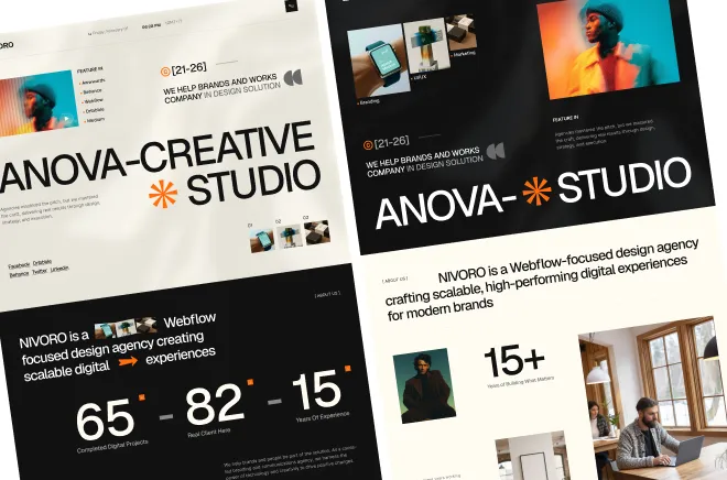
Ready to launch, MCP 2.0 ready agency template.
Available for new project


Accessibility is the most underrated quality dimension in Webflow design. It is also the area where most templates fail their Webflow review. Missing alt text on images, broken heading hierarchies, and insufficient color contrast are not just accessibility problems — they are SEO problems, performance problems, and increasingly, legal problems. Building accessible Webflow sites is not harder than building inaccessible ones. It just requires knowing what to check and when to check it.
Webflow's review team consistently flags four accessibility issues: missing or generic alt text on images, incorrect heading hierarchy (H1 used multiple times, or headings skipped), insufficient contrast between text and background, and interactive elements that lack visible focus states or keyboard accessibility. Each of these is easy to fix once you know to look for it — and each makes a meaningful difference to real users and to search engines.


Start with heading hierarchy. Every page should have exactly one H1 — typically the main page title or hero headline. H2 marks major sections. H3 marks subsections within those. Never skip a level and never use heading tags for styling purposes alone. Correct hierarchy helps screen readers and SEO equally.
Add meaningful alt text to every image. Decorative images that carry no content meaning should receive empty alt text (alt="") so screen readers skip them. Images that carry meaning — product photos, team portraits, diagrams — need descriptive alt text that communicates what is shown. Alt text should be concise but complete.
Check color contrast using a tool like WebAIM's contrast checker. Text on colored backgrounds needs a minimum contrast ratio of 4.5:1 for normal text and 3:1 for large text. Background images under text are particularly problematic — always add a solid color fallback or a dark overlay to ensure readability regardless of image loading. Contrast is not a design compromise; it is a quality standard.
For interactive elements — buttons, links, accordion triggers, tab items — ensure that keyboard users can navigate and activate them. Webflow's native components handle this well, but custom elements built with div blocks need explicit focus styling and ARIA attributes. Every interactive element needs to be keyboard-accessible.
Test with a screen reader. Tools like NVDA (free, Windows) and VoiceOver (built into Mac) let you experience your site the way screen reader users do. This reveals issues that automated checking misses.
Accessible design is not a constraint — it is a quality signal. Sites that are accessible are more usable for everyone, rank better in search, and reflect a level of craft that separates professional work from amateur work. Build it in from the start, not as an afterthought. When you choose an Exceptional Quality template, accessibility is already built in.
Some Important Takeaway Key points:


